


Outside of London, there’s a long way to go before job levels get back to their peak

The latest jobs figures provide yet more evidence that the collapse in construction may be slowing down.
The number of construction workforce jobs on the ONS seasonally adjusted figures rose slightly and was roughly the same as in the same period a year ago.
These workforce jobs figures broadly support the picture painted by the employment figures released a month ago.
The workforce jobs data do however provide us with a view of what is happening at a regional level.
To give a feel for what this might means I have put together three graphs illustrating how the jobs position over the past year for each of the English regions, Scotland, Wales and Northern Ireland compares with the peak, the trough and the level in 2007, when the credit crunch changed the world.
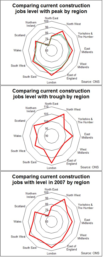
The data presented take the average over four quarters and compares that with the average of the four quarters up to June 2013, which we can take as representing roughly where we are now. This is less sensitive than taking quarterly data, but it irons out the volatility and reduces the effects of statistical noise.
The choice of scale was taken for both aesthetic reasons and to aid illustration. But it does in the case of the first and third graphs visually exaggerate the impact as the centre is set at 50% not zero.
The first graph shows in the red line how far from peak (100) each of the regions and countries were at the end of June. The green line shows how far relative to their various peaks each one fell at worst.
It is very clear from this chart that, outside of London, there’s a long way to go to get back to peak jobs. In most cases between 15% and 25%. Northern Ireland has its obvious particular problems.
The second graph, highlights the bounce back for each region from the low point. It’s very noticeable how many parts of the UK are still at or near to their low point in terms of construction employment. London is the clear exception, with the North West also looking a bit more sprightly than most.
The intriguing regions when looked at in this way are, in many ways, the East of England and the South-east. These you might have expected to be a little more buoyant. Part of the explanation here is that the fall in jobs numbers in these regions came later than elsewhere and so the current levels are pretty much at the low point.
And as other regions fell into recession there was still significant growth in the broader South-east underpinned by large projects such as the Olympics. This boosted the level of the peak so any collapse from there was likely to be more pronounced.
Also these regions, as far as the labour market is concerned, are very closely wedded to London, so should in some ways been seen as constituting a broader South-east labour market. Taking the group as a whole the shedding of jobs was less severe.
The third graph shows how jobs in each part of the UK compare with the level in 2007. This perhaps gives a better indication of where the damage has been done to the industry.


No comments yet