


Dulux Trade Contract Partnership’s debate saw speakers from the design and architectural world talk about how colour brings projects to life. Ike Ijeh finds out more
The Panel
Hilary Dalke, director of Cromocon and Kingston University professor of design
James Soane, director of Project Orange
Lisa Pilley, senior designer from Dulux Trade
Robin Partington, from Robin Partington & Partners
Graham Rollins, associate at Lighting Design International
Colour is one of those things that heavily informs all our lives but that we all too frequently take for granted. All we have to do is to simply imagine a world without colour in order to appreciate how crucial it is to our built environment and psychological well-being. Colour is also one of the key cornerstones of design whether it relates to architecture, lighting or interiors. It also has substantial behavioural and commercial ramifications and offers a slew of benefits with regard to establishing character, style, atmosphere and both personal and corporate identity.
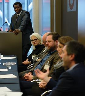
These are the issues that were discussed at the Building Colour Debate held in association with Dulux Trade Contract Partnership scheme on 28 November. The assembled speakers each provided a unique, professionally informed insight into the opportunities available to the design and construction community by the intelligent use of colour.
Colourful debate
First on was professor Hilary Dalke, director of design research at Kingston University in south-west London. Hilary presented a fascinating exploration of the theoretical principles of colour and provided research and evidence-based case studies that demonstrated its impact on both our behaviour and environment.
There are boundless opportunities available by boldly but intelligently incorporating colour
Under a series of keynote headings such as ‘How Important Is Colour for Good Design?’ and ‘Can Colour Selection Have Commercial Ramifications?’ professor Dalke provided a series of examples that articulated the benefits of colour and proved its influence on the way in which spaces are used. These included the fact that fatalities in US factories reduced by 18% when a different shade of orange was adopted to indicate danger and evidence of how social interaction and morale were boosted in prison and healthcare facilities when new colour schemes were introduced.
Next was James Soane from architecture and design practice Project Orange. Soane extended Dalke’s polemic on the theoretical properties of colour but also levelled this against historical context by exploring how style, fashion and taste inform ongoing cultural shifts in how colour is perceived by society at different times. Soane also provided case study examples of how colour has informed his own practice’s work.
Seeing the light
Graham Rollins from Lighting Design International introduced a key aspect to the discussion without which colour would not even exist: light. Beginning with a technical analysis of the relationship between light and colour, Rollins moved on to presenting a series of projects completed by his practice that indicate how the practical manipulation of colour and light is indivisible. He also explored how these two elements are crucial factors in both determining and reflecting the atmosphere and mood of interior and exterior spaces.
Lisa Pilley is a senior designer at Dulux Trade and she provided an insight into AkzoNobel’s Colour Futures programme, which has been predicting trends and colours for 10 years. Pilley revealed the forensic techniques employed to garner this data which range from exhaustive analyses of colour palettes popular from recent years to exploration of the pervading social, economic and political trends that might influence the colours that prove popular during any given period.
Look to nature
The debate closed with an impassioned presentation from Robin Partington of Robin Partington Architects. Formerly an employee of Foster + Partners, Partington provided a personal perspective on how his own appreciation of colour had evolved over the years from the clinical white, grey or monochrome of landmark Foster schemes such as the Gherkin, Duxford Air Museum and the ITN HQ to a richer appreciation of the boundless opportunities available by boldly but intelligently incorporating colour into buildings.
Partington explained that the paradoxical reluctance of contemporary society to embrace colourful buildings while at the same time revering those built in the past was a symptom of cultural unease with the principle of simulating colour in architectural materials rather than employing materials with the natural polychromatic capabilities. He closed with a call for us to look towards nature as the ultimate example of the drama and emotion that colour can create.


1 Readers' comment