


Our latest CPD module explores the many factors that influence our perception of colour, and shows how this knowledge can be used to inform interior decoration schemes. It is sponsored by Dulux Trade

How to take this module
UBM’s CPD distance-learning programme is open to anyone seeking to develop their knowledge and skills. Each module also offers members of professional institutions an opportunity to earn between 30 and 90 minutes of credits towards their annual CPD requirement.
This article is accredited by the CPD Certification Service. To earn CPD credits, read the article and then click the link below to complete your details and answer the questions. You will receive your results instantly, and if all the questions are correctly answered, you will be able to download your CPD certificate straight away.
CPD CREDITS: 60 MINUTES
DEADLINE: 16 OCTOBER 2015


INTRODUCTION
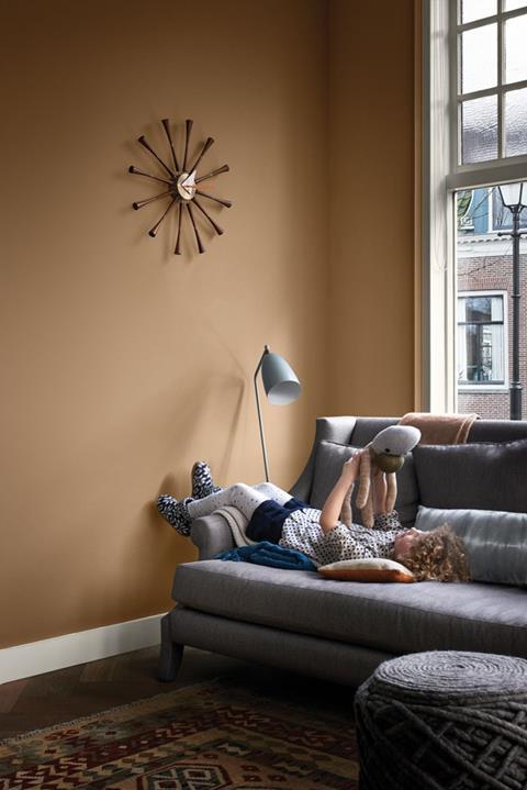
Specifiers take different approaches to choosing coloured coatings for a project. For many, colour is integral to the design, along with the building materials chosen. For others, it comes later in the project, and involves a difficult process of trying to convey a particular character or atmosphere. One thing is certain however: colour is often the first thing that visitors and users of a building will observe and as such deserves careful consideration.
This CPD will examine the various factors that determine how humans perceive colour, and provide guidance on creating a colour scheme.
PERCEPTION OF COLOUR
What do we “see” when we look at a coloured object? The colour we observe can be different almost every time we look. This is because colour perception is not static or uniform; it is relative to many different factors. These include:
Contrast
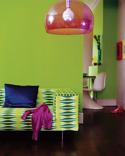
Surrounding colours can dramatically influence how our brain interprets a colour. For example, a blue colour sample appears darker on a yellow background than a brown one. Similarly, grey can appear greenish against a red background and reddish on a green one.
In order for a viewer to see a colour correctly, it should always be placed on a neutral background. When choosing colours, it is always advisable to compare them side by side on the same background.
Surface area and distance
Colours covering a large area often tend to appear brighter and more vivid than those covering a small area. In practical terms, this is an important consideration when selecting from small chips on a white background – a splash of colour that might not look overwhelming when only 3cm high will make a much greater impact when applied to a 3m-high wall.
Distance affects our perception of colour in a similar way. As we move away from a surface and it starts to shrink in perspective, the colour is altered by the wider field of vision. Moreover, in external environments, atmospheric conditions can have an impact. A good example is a mountain range, where the more distant mountains appear to fade to a blue-grey.
Surface texture
The finish of a paint – whether it is gloss, silk or matt – is known as its sheen. The sheen level has a huge impact on how a colour appears, particularly in terms of depth of colour. A colour can look different in different sheen levels due to the way light is absorbed or reflected by the paint finish.
In the same way, surface texture also affects perception. A coloured paint will not look the same on a smooth surface as on a rough surface. This is partly due to the surface texture affecting the paint’s sheen level. On a rough surface, light is diffused and diffracted, whereas a high-gloss paint on a smooth surface gives a mirror-like effect reflecting light back smoothly.
Natural light
Natural light changes with the location, season, and direction. British light has a grey base, due to our northerly position and generally cloudy weather. This can have a significant effect on how all colours look.
Light entering a building will differ depending on the room’s aspect. Light from the north will always be greyer, yet more constant than from any other direction. South-facing rooms can be very bright, and with so much light some colours can become overpowering.
Also consider if a room is in use principally at one specific time of day. Brighter midday light is different to dusky early evening light, for example. In the past, large British homes had “morning rooms” that were used particularly at that time of day and decorated to make the most of the morning light.
Artificial light
Colour can change quite dramatically under different types of artificial lighting:
- Tungsten This is a warm light that reflects back from warm colours but makes cool colours appear dull. Tungsten lights cast a yellow glow and can detract from colour schemes by adding an unwanted yellow tone. For an area that mostly uses this lighting, compensate by choosing warm colours that have a little more yellow in them.
- Halogen This is the closest artificial alternative to natural daylight and both warm and cool colours remain “true”.
- Fluorescent Low-energy and fluorescent bulbs cast a cool watery light that can reduce vibrancy in some colours. Cool colours appear brighter but warm colours will absorb the light and appear dull.
- LED This is one of the most dynamic areas of lighting development and there is a wide variety of types and colours. While white LEDs can be quite close to natural daylight, the effect can sometimes be quite stark. It may be necessary to try a range of LEDs with different colour temperatures to get the desired outcome.
Cultural factors
Even if two people see the same colour in exactly the same way, they may still respond to it differently. Colours and colour combinations have different associations in different cultures. For example where black is worn for funerals in the UK, people in Asia would wear white; likewise, while red is a sign of danger in many cultures, it is considered lucky in China.
DESCRIBING COLOURS
Because colour is a matter of perception and subjective interpretation, people will draw upon their own unique references and experiences to express or infer colour. Many consumers like colours to have names, but this can be misleading. For example, “Tuscan Glade” might hold a very different resonance for people in different countries.
Nevertheless, it is necessary to have a system of descriptions that will be universally understood, such as a reference or notation.
While colour names provide an emotional frame of reference, architects and other designers use a variety of colour notation systems. These include:
- Natural Colour System (NCS), which describes all colours in terms of six elementary colour components: white, black, yellow, red, blue and green
- RAL, a German standard that expresses 1,625 colours with a seven-digit code
- British Standard BS 4800:2011, which specifies 122 colours of paint for construction works
- Pantone, a colour system based on 13 base pigments (plus black), mainly used in printing and product design
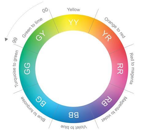
- Dulux Trade Colour Palette, in which each colour has a seven-digit reference number reflecting the three main properties of colour: hue, light reflectance value (LRV) and chroma. These are explained in more detail below.
Hue
This is the colour family; within each hue there is a scale from 00-99 indicating the colour’s position within the hue on the colour wheel (see figure 1).
LRV
This defines the lightness or darkness of a colour on a scale of 1-99, relating to the percentage of light that is reflected from the surface. The higher the number, the lighter the colour. For example, the colour with the highest LRV in the Dulux Trade palette is Absolute White from the Light & Space range, which has an LRV of 92. The LRV is vital to meeting the requirements of Part M of the Building Regulations, and therefore the Equality Act 2010, which stipulates a difference of 30 LRV points between elements such as walls, doors and floors.
Chroma
This is the intensity of the colour. A three-digit number on a scale of 000-999 represents the level of colour saturation. The higher the number, the more intense the colour, but the maximum chroma also depends on the hue – for example, yellow has a very high maximum chroma, whereas for blue the maximum chroma is much lower.
COMBINING COLOURS
There are numerous apps that aid colour choice or suggest combinations. Three common approaches to colour schemes are described below.
- Tonal variation This involves using lighter and darker shades of the same colour, ensuring coordination across the whole room
- Harmonising A harmonious scheme involves two or more colours that sit next to each other on the artist’s colour wheel. This places red, yellow and blue at 120 degrees from one another and creates a secondary shade by progressively blending with the next colour round. Therefore, a typical harmonious scheme may match blue and violet, or green and turquoise.
- Contrasting A contrasting scheme uses colours that are opposite each other on the artist’s colour wheel. This often creates a dramatic and contemporary feel.
Materials and textures can also play a role in a harmonious or contrasting scheme. Soft, matte, dry, textured or light materials tend to have a warm effect. Hard and glossy surfaces often evoke a cooler feel.
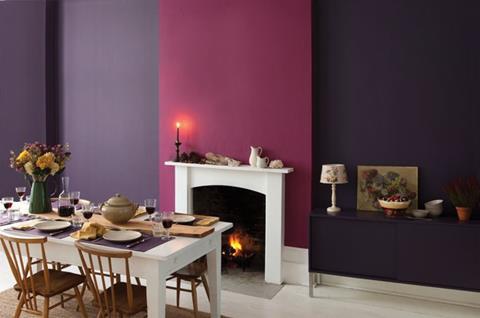
Creating an atmosphere
It is generally accepted that red and yellow tones will add warmth, while some tones of blue and green can be associated with a calmer, more relaxed feel. But there is a lot more to creating an atmosphere than that. Within each hue, there are further divisions. These can be described in terms of tints, tones and shades:
- Tints are the hue lightened with white. For example, where deep red is the hue, a pastel pink is a tint
- Tones describe colours with the hue “greyed off”. This creates the type of colours often seen in heritage-style palettes
- Shades are closer to the original hue but deepened with black, often with dramatic effect.
Tints and shades close to the original hue can help to create vibrant, uplifting schemes.
The greyer tones and shades provide calmer, tranquil spaces and a more understated or sophisticated feel.
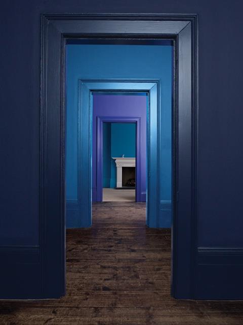
Light vs deep shades
The balance between dark and light shades can be used for many purposes. It may be for signposting, to highlight specific areas or to suggest a direction of movement.
The degree of saturation also determines the way we interpret distances. Pale colours can make objects or surfaces appear to recede, while deeper colours make them seem closer. Certain colours, such as red, exaggerate this further.
This illusion can be used to visually “correct” the size of a room. For example, a ceiling painted in a warm saturated red seems to reduce the height of the room while a cold pale blue exaggerates the height.
Colour trends
Colour trends are, by definition, continually changing. Accessing trend information can bring fresh inspiration and help specifiers to produce schemes that are in step with other elements of design, such as architecture or furnishings.
Trends can emerge from a variety of sources – whether design, technology, architecture, nature, fashion, music or popular culture. These macro trends are translated into curated palettes of colour, and associated design elements.
Choosing from an individual trend palette, such as AkzoNobel’s Colour Futures publications, is a quick way to find colours that will work well together. However it is still important to remember the factors discussed above, such as proportion and lighting.
How to take this module
UBM’s CPD distance-learning programme is open to anyone seeking to develop their knowledge and skills. Each module also offers members of professional institutions an opportunity to earn between 30 and 90 minutes of credits towards their annual CPD requirement.
This article is accredited by the CPD Certification Service. To earn CPD credits, read the article and then click the link below to complete your details and answer the questions. You will receive your results instantly, and if all the questions are correctly answered, you will be able to download your CPD certificate straight away.
CPD CREDITS: 60 MINUTES
DEADLINE: 16 OCTOBER 2015
Privacy policy
Information you supply to UBM Information Ltd may be used for publication and also to provide you with information about our products or services in the form of direct marketing by email, telephone, fax or post. Information may also be made available to third parties. UBM Information Ltd may send updates about Building CPD and other relevant UBM products and services. By providing your email address you consent to being contacted by email by UBM Information Ltd or other third parties. If at any time you no longer wish to receive anything from UBM Information Ltd or to have your data made available to third parties, contact the Data Protection Coordinator, UBM Information Ltd, FREEPOST LON 15637, Tonbridge, TN9 1BR, Freephone 0800 279 0357 or email ubmidpa@ubm.com. View our full privacy policy at www.building.co.uk/cpd


No comments yet