


After the planning hoo-ha that saw Chipperfield’s original proposals dropped, Wright & Wright has delivered a major yet subtle expansion of the former Geffrye Museum – now renamed Museum of the Home – that visitors may not even notice. Richard Gatti reports
“I think it’s going to work well as a museum without making a big fuss.”
That’s Clare Wright, partner at Wright & Wright Architects, on the refurbished Museum of the Home in east London, which reopened on 12 June. The £18m project undertaken by her practice upgrades the existing buildings and gardens, and adds gallery and events spaces and a library, as well as relocating the entrance. It’s not that Wright & Wright have been unambitious. Rather their aim is to stitch the city back together by working with the fragments already there – to make an impact without creating icons.
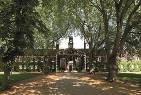
What is now a museum was originally built as almshouses in 1714, as part of a bequest from the estate of English merchant Sir Robert Geffrye, who was master of the Worshipful Company of Ironmongers and lord mayor of London. The almshouses form a U shape, with two side wings almost but not quite touching a longer bar that is centred on a chapel. The slightly proud chapel is surmounted by a statue of Sir Robert – though as at least some of his fortune was derived from the slave trade, its future is subject to ongoing discussions between staff, trustees, funders and the local community.
The almshouses form three sides of a broad quadrangle, defined by mature London plane trees and wide avenues of bound gravel – the fourth side is the Kingsland Road. It is good, set-piece Georgian architecture: rigorous in symmetry and repetition but with enough variation to make it interesting. It holds grade I listed status and, from the Kingsland Road elevation, is essentially unchanged from when it was built.
While the almshouse are two storeys tall when viewed from Kingsland Road, from the rear they are a storey taller. That disparity in section is deliberate – the builders asked the inhabitants of Hackney to fill what is now the front quadrangle with rubbish to raise the level. This is slightly disjunctive – you do not notice a slope when walking from the front of the site to the rear, but it allowed the old ironmongers to enter their homes at a piano nobile of sorts.
The building’s subsequent history is complicated, and key to understanding Wright & Wright’s interventions. Partner Naila Yousuf, lead architect on the project, explains: “As land values rose in Shoreditch [in the early 1900s], several livery companies sold their almshouses. The Ironmongers Company considered an offer from the Peabody Trust, which hoped to demolish the almshouses and build model dwellings. Concern over the potential demolition of the buildings and the loss of open space was raised by the Society for the Protection of Ancient Buildings, the National Trust, Shoreditch Vestry and Metropolitan Public Gardens Association.”
After a sustained campaign, the buildings were acquired by London County Council and became a museum of furniture. Some alterations were made to facilitate this: most obviously, the windows to the rear were blocked up and a glazed elevated walkway was installed to bypass the chapel at the rear. This eventually became the museum’s tea room.
More significantly, the almshouses themselves were adjusted to accommodate the museum. The upper floors were cut back to provide a mezzanine area and improve air flow. Internal staircases and some party walls were removed, and clerestory windows were cut into the facade facing the courtyard at basement level, which had the effect of weakening the retaining wall. These structural alterations had long-lasting consequences: over the years, steel was added to the half-basement ceiling and the usefulness of the mezzanine areas as storage decreased.
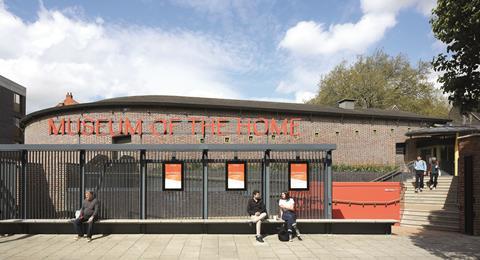
A contrasting pair of 1990s additions point to potential redevelopment strategies. The new entrance by the Conservation Partnership, built in 1992, nestles into the corner between the north wing and the main run of almshouses. It borrows its form and material from the chapel-bypassing walkway – dark-stained timber and plentiful glazing in a regular rhythm. The exhibition centre designed by Branson Coates was described by one of its architects, Nigel Coates, as “taking many clues from the existing building” – but the sinuous, horseshoe-shaped form, curtain walling and branching steel columns in lime green owe little to the Georgians. Which is not to say it isn’t complementary: the sloping courses of grey London stock brick certainly set up a dialogue with the original almshouses. In operating through contrast, it has given the museum’s subsequent architects two very different contexts to work with.
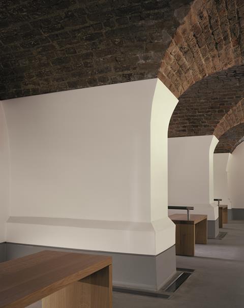
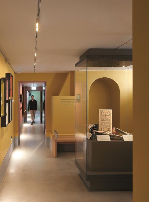
Understanding Wright & Wright’s interventions without this context is difficult. Their big moves are obvious – the sort of obvious that is impossible not to see in retrospect, but hard to imagine in advance. They have simply returned the almshouses to almost their original state: reattaching the first floors to create a new level that now forms storage areas and a reading room, and opening out the lower ground floors as exhibition space.
And there you go: 80% more exhibition space, less precarious storage and, by reintroducing party walls on the lower floor and hiding services within the retaining wall, they’ve dealt with historic issues of stability and environmental performance as well. These interventions are sensitively done – the floor has been lowered by about 500mm (you can tell by the sizes of the doors that the Georgians were shorter than we are), and the point where the original foundations kick out is expressed to become an enlarged skirting of sorts. The floors are a muted concrete, with the lines of the original stair cores and party walls (where these have not been reinstated) picked out in brass. This is not only a subtle referencing of the past but also a pragmatic way to conceal a necessary expansion joint.
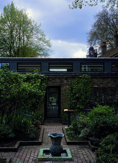
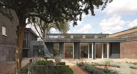
These new spaces have relatively low ceilings (about 2.4m), and reinstated party walls lend a cosy, domestic air that feels apt to their subject matter. Besides, as Clare Wright points out, “a white canvas is not neutral” – which feels like a succinct critique of the European museums and galleries she visited for inspiration. This sense of exhibition spaces as rooms continues into the garden. The landscaping, designed in conjunction with the museum’s head gardener and Dominic Cole Landscape Architects, is conceived as a series of rooms, each corresponding to the size of the adjacent almshouse. While these are connected, each external room has a sense of intimacy, and a direct connection to each gallery space via the reinstated doors and windows, which again reinforces homeliness and reduces sterility.
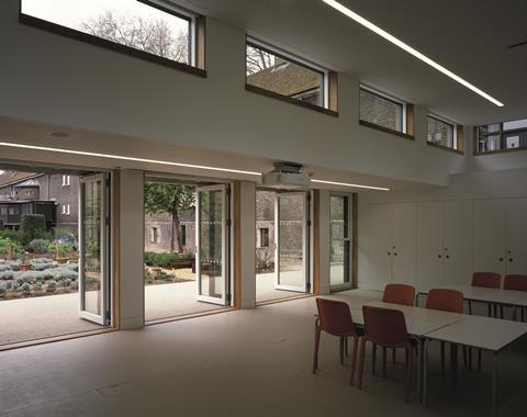
The gardens are bookended by two new pavilions, one clad in dark-blue timber slats, another that reads as an outcrop of the existing brick boundary wall. Both are discreet, polite presences, one-and-a-half storeys high, with clerestory windows supplementing generous openings onto the garden.
One functions as a learning space, with its own garden and separate entrance to safeguard vulnerable visitors and facilitate school trips. The other functions more as an events venue, allowing the museum to host talks and events without sacrificing exhibition space.
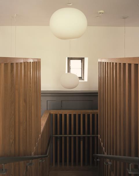
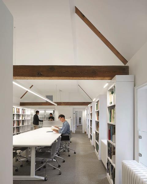
At first-floor level the reconnected floorplates provide largely back-of-house functions, but there is a public reading room formed from the upper floor of three of the original houses. The original ceilings were low, and subsequent structural and servicing alterations have raised the floor, compressing the space further. The ceiling has now been opened out to the pitch, with the original beams left exposed – their height now defines the top of bookshelves. The resulting space is light and characterful – the original windows are retained or reopened, and their somewhat haphazard relationship to the floor level is celebrated, rather than hidden.
The staircase that gives access to the upper floor is the one moment of obvious “design” and it reads, appropriately enough, as an oversized piece of furniture. Formed from slatted oak planks, and completed without a stringer, it is hybrid in function: part staircase; part bookshelf and part hidey-hole for younger visitors. It defines a point part way through the museum where you might want to stop, have a chat or pull up a chair and read a book.
The main entrance is relocated to the curve of the Branson Coates horseshoe. This is the largest and lightest space in the museum, and contains the shop, toilets and access to three main gallery spaces. It is a typical Wright & Wright move – a singular gesture, working with the existing fabric to replace a convoluted plan with something more legible and accessible.
And there you go: 80% more exhibition space, less precarious storage, and they’ve dealt with historic issues of stability and environmental performance as well
The new entrance, which is at first-floor level, is accessed from Geffrye Street by a set of sweeping planted ramps. The street widens out opposite Hoxton station to form something of a square – an impression reinforced by the introduction of a long bench on the northern facade. At this proto-piazza, ironwork gates slide back to open the gardens to public view. Above the gates, new signage in coral red reflects the London Overground roundel, and the same colour is picked up in the vibrant tulips beneath the entrance.
To the left of the museum is an old pub, also owned by the museum. This had been slated for demolition in previous proposals by David Chipperfield Architects, but public opposition resulted in planning refusal in 2013 – a decision that ultimately resulted in the museum seeking a new architect.
Project team
- Architect, lead consultant, conservation architect, planning consultant, contract administrator, furniture and fittings designer Wright & Wright Architects
- Client Museum of the Home
- Main contractor Quinn London
- Structural engineer and heritage consultant Alan Baxter
- Services, lighting and acoustic engineer Max Fordham
- Quantity surveyor and project manager Gardiner & Theobald
- Fire engineer Menzies Partners
- Landscape architect Dominic Cole Landscape Architects
- Principal designer adviser Stroma Group
- Exhibition designer ZMMA
- Exhibition contractor Elmwood Projects
- Wayfinding consultant DN&co
- Furniture procurement Collaborate
Wright & Wright’s reworking has retained the pub as a cafe space; because they have squeezed most of the programme into the existing building it was unnecessary to put gallery space into the adjacent site. This, along with the upper storeys of the pub, has been redeveloped as flats for rent in a deal with developers that gave the museum £2m for match funding. Equally pragmatic is the decision not to redevelop the whole site: a similar-sized plot next door is available for future museum expansion – or future fundraising.
If you are visiting the museum for the first time, you could be forgiven for not noticing a multimillion-pound refurbishment that has added 80% more gallery space, improved the structure and servicing, deftly relocated the entrance and cafe and provided new educational and events spaces. I rather think Wright & Wright would be pleased with that.
Downloads
Almshouse _ Pavilions Section 1.500 @ A3 W Annotations
PDF, Size 0.69 mbAlmshouse Cross Sections _ Pavilion Elevations 1.500
PDF, Size 0.62 mbFirst Floor GA 1.500 @ A3
PDF, Size 0.59 mbLearning Pavilion Plans 1.250 @ A3 w Annotations
PDF, Size 0.55 mbLower Ground Floor Plan 1.500 @ A3 w Annotations
PDF, Size 0.82 mbLower Ground Floor Plan 1.500 @ A3
PDF, Size 0.81 mbStudio Pavilion Plans 1.250 @ A3 w Annotations
PDF, Size 0.47 mbAlmshouse Elevations 1.500 @ A3
PDF, Size 0.68 mbStudio Pavilion Sections 1.250 @ A3
PDF, Size 0.53 mbAlmshouse Cross Sections _ Pavilion Elevations 1.500 @ A3 w Annotations
PDF, Size 0.62 mbAlmshouse _ Pavilions Section 1.500 @ A3
PDF, Size 0.68 mbFirst Floor GA 1.500 @ A3 w Annotations
PDF, Size 0.6 mbStudio Pavilion Plans 1.250 @ A3
PDF, Size 0.47 mbCross Sections - Existing _ Proposed
PDF, Size 0.93 mbLearning Pavilion Sections and Elevations 1.250 @ A3
PDF, Size 0.95 mbLearning Pavilion Plans 1.250 @ A3
PDF, Size 0.55 mb
Postscript
Richard Gatti is a founding director of Gatti Routh Rhodes, Building Design’s Young Architect of the Year in 2019


1 Readers' comment