


Calculating what projects cost in different parts of the world can be fraught with problems, including difficulties in comparing like for like across regions and fluctuating exchange rates. Turner & Townsend has adopted a purchasing parity power methodology to arrive at intelligent comparisons of international costs

01 / Introduction
Infrastructure clients are often complex organisations with multiple stakeholders, composite ownership structures, circuitous regulatory authorities, wide-ranging tenants in the form of the airlines and millions of different users, all of us included, of course.
One thing that is consistent around the world though is that clients all want to know how they are performing against their peer groups, where they can improve and how to make better decisions in the development process. Many in emerging or maturing economies are developing shiny new terminals, stations and ports, while others are moving into a period of improving the assets they already have.
It’s not just clients and their shareholders who wish to compare performance, but also politicians, policy makers, the construction industry supply chain, academics and
often taxpayers if public money is invested in infrastructure.
Comparable data can help to better inform the decision-making process and clients are starting to understand this. One problem with comparisons in the infrastructure sectors is that peer groups are often in other countries thousands of miles away.
Comparisons have historically been contentious because of the multiple variances of currency and market conditions over and above the variables of stakeholders, geography, environment and the construction process. So can we compare costs across countries?
Present two numbers based on the cost per square metre for construction and a whole host of questions may be asked. Why does it cost more to build an airport here than in country X? Is our construction sector less efficient? What is pushing up costs? Is it wages? Are our industrial relations systems hampering productivity? Did the previous government introduce too much red tape? Are we falling behind in skills, use of machinery and technology?
These are all valid questions. Unfortunately, a lot of problems start with the two numbers themselves. The issues fall into two camps - comparing like with like and currency and market conversions.
Another problem is that the range of metrics available are consistently too narrow and might not be appropriate to the question asked. For example, how often is schedule data or operating cost information used to inform price and time integrated decisions. Adding operating cost data provides another layer of complexity to the calculation.
The differing attributes and commercial drivers across regions are complex, but must be appreciated. They will arise from geography, environment, aesthetics, carrier type and fleet mix. That is why the use of “intelligent data” is so important.
02 / What is intelligent data?
Intelligent data is developed through the acquisition of multiple sources of information, and structuring and analysing that data so it can be used in a meaningful and practical way to add value, improve business cases, strip out waste and to adopt a continuous improvement approach.
Irrespective of the methodology used to compare costs, it will be essential to establish a common scope in relation to the “heads of cost” and a common data breakdown structure.
In other words, it is clear and unambiguous as to what’s in and what’s out. Take the most basic and commonly measured gauge of development efficiency - cost per square metre.
Often clients will have developed their own structures which will vary from their peers’. The only practical approach here is to develop a generic “one size fits all” structure which may have to be set at a higher level. Assuming that we can come up with two numbers which reasonably compare like with like, then the exchange rate is the second difficulty.
It is tempting when presented with two costs per square metre to convert them to a common currency, such as US dollars or British pounds. But this can be misleading. Exchange rates can fluctuate strongly over time and can result in the potential misrepresentation of comparators.
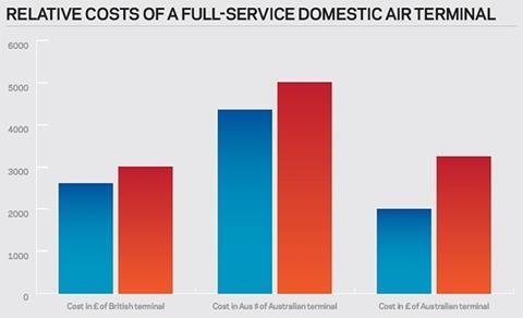
03 / UK versus Australia: Costing up a domestic air terminal
In the following example the cost per square metre of a full-service domestic air terminal in the UK is compared with the cost of a terminal in Australia. The 2014 costs are in the ballpark for a domestic terminal, as shown in Turner & Townsend’s International Construction Cost survey 2013, but have been rounded up a little to help illustrate my point. Let’s assume a notional 15% growth in construction costs in each country since mid-2008.
A problem occurs when you convert the Australian cost to pounds at the average exchange rates between 2008 and 2014.
If you look at the cost increase of the Australian terminal in pounds, rather than a 15% rise over the time period, you see a 63% increase. In pounds, Australia has gone from being 23% cheaper that the UK in 2008 to 8% more expensive in 2014.
This is the kind of information that can agitate policy makers and politicians, and indeed that is exactly what has occurred in Australia. Faced with similar examples, the local press, politicians and everybody with an agenda to promote have called for inquiries into why Australia has become so uncompetitive and prices have risen so much in comparison with other countries.
Yet, the example shows that prices increased the same in Australia as in the UK. The exchange rate has gone from 0.46 in 2008 (or AUD$ 2.17:GBP 1) to 0.65 in 2014 (or AUD$1.53:GBP 1). One pound now buys fewer Australian dollars.
The problem illustrated here was caused by the appreciation of the Australian currency, partly as a result of the country’s mining boom. It is the reason why travellers from the UK scratch their heads at how expensive it has become to buy a pint of beer or a meal in Australia, and yet Australia has in recent history had relatively low price inflation.
04 / The purchasing power parity method
To overcome the exchange rate issue Turner & Townsend has been trialling a comparative approach using “purchasing power parity” (PPP), a technique used by economists to better compare international costs by using the cost of living in each country. A well-known example of PPP is the Big Mac index, pioneered by The Economist magazine. This compares the price of a Big Mac around the world and effectively creates a hamburger index as a crude cost of living comparator.
The box right provides a simple example of how PPP can work effectively in construction. Turner & Townsend uses the CitiBloc method developed by Brisbane’s Bond University’s Centre for Comparative Construction Research. This uses a basket of 10 items typically used everywhere in construction roughly in the proportion of 40% labour costs, 50% materials costs and 10% plant. The basket of goods is priced in the local currency in each country.
In Turner & Townsend’s International Construction Cost Survey 2014, the costs of different building types, material, trades and labour are given in the local currency, US dollars at current exchange rates, and in PPP terms. Over time we will be adding more regions and countries to the survey and refining the PPP indices to account for the booming infrastructure market and the impact that has on the construction “basket”.
If the ultimate owner of an airport facility is a multinational paying in British pounds, for example, for an Australian facility, then conversion of current costs at current exchange rates would still have its uses, but PPP is the more appropriate method to use to make judgments about the competitiveness and efficiency of a country’s construction sector, especially when used to develop policy. The PPP method takes exchange rate fluctuations out of the equation.
The cost of construction in CitiBlocs in a country should be stable over time, but may be improved by the use of technology, better productivity and improved efficiency. Conversely, factors that worsen productivity - red tape, strikes, supply chain bottlenecks - would cause the PPP cost in CitiBlocs to increase.
While it is still relatively early days in the adoption of PPPs in construction - and Turner & Townsend is not the first to use the method - the technique will be a useful tool for more careful analysis.
An example of how purchasing power parity can be used to compare costs:
- Cost of a basket of construction materials, labour and plant in high cost country = 10 high cost country coins.
- Cost of similar basket in low cost country = 5 low cost country coins.
- Cost of a building in high cost country is 1,000 high cost country coins. This is equivalent to the local cost of 100 baskets (ie 1,000 divided by 10).
- Cost of a building in low cost country is 600 low cost country coins. This is equivalent to the local cost of 120 baskets (ie 600 divided by 5). In relative purchasing power parity (PPP) terms the low cost country uses up 20% more baskets than the high cost country. In PPP terms it costs 20% more.
- If the cost of building in the low cost country was only 500 low cost country coins, equivalent to the local cost of 100 baskets, then both countries will have equal PPP costs.
- The differences may be caused by variations in construction efficiency, local construction methods, building specifications, margins, overheads or other factors.
05 / Conclusion
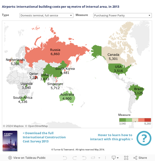
The analysis of PPP values in the air sector as shown in the “heat map” graphic does throw up some interesting findings which appear to be worthy of more detailed investigation. You can see from the world map that PPP ratings in the air sector are highest in the Middle East and low in the US. Environment and geography will be drivers here and the figures are heavily “smoothed” in each country, but it does suggest that significant efficiencies in new terminal development can be made through learning from best practice elsewhere.
High Russian PPP values in the air sector is another good example that illustrates the local challenges associated with programme governance, regulation and approvals for non-repeatable and complex facilities. In the interactive form you can see that other less-complex sectors there perform better in comparison.
In a perfect world the exchange rate will accurately reflect the relative cost of living in any two comparative countries. For example, the cost of a CitiBloc in the UK was £5,619 whereas in Australia it was AUD$10,424. This should give an exchange rate of 0.53. Instead the rate has fluctuated between 0.40 and 0.65 (annual average) during the past 10 years. That is why we need PPP.


No comments yet