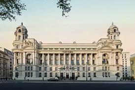
The new offices are in a nondescript and dingy 1920s brick building, with most of the ground floor given over to a post office. It is a huge change from the distinguished terrace houses that served as the publisher's extended home for decades.
The interiors on three floors are an entirely different affair. They are so stylishly modern, effortlessly refined and meticulously executed that they would look perfectly at home in the pages of the latest Thames & Hudson volume on architecture. The architect is John McAslan & Partners, which was this week named Architectural practice of the year in the 1999 Building Awards.
"The company had a keen idea of what it wanted aesthetically," says McAslan project architect Ian McChesney. "It didn't want an office environment – it wanted a creative warehouse." And a creative warehouse is exactly what it got, with plenty of creative design thrown in, too.
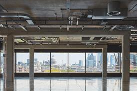
With flowing spaces and ample daylight, the interior feels open plan, which is how the architect wanted to design it originally. In fact, the external walls are largely lined with cellular offices, as the book editors rebelled against the potential noise and disruption of an open-plan design. The light, airy and spacious effect has been achieved by designing partitions opposite the windows and clerestory strips below the ceilings in clear glass. More headroom has been created by removing suspended ceilings.
A delicate staircase with open treads, clear-glass balustrading and slender metal handrails cuts through the second and third floors, adding to the sense of flowing space.
The palette of materials is spare and, in places, industrial, reminiscent of a minimalist loft apartment. Walls, ceilings and partitions along the sides of the cellular offices are plain, white-painted plaster. The flooring is grey carpet. The storage cabinets are painted muted purple. Overhead, exposed ducting and trunking are in unadorned galvanised steel.
Yet the result is anything but frigid and spartan. Doors and framing to the partitions, desks, stair treads, and woven slats covering a large central services riser are all in maple. The golden wood creates a space that is warm, natural, and welcoming – like a Scandinavian penthouse.
The refined and meticulous detailing is particularly evident in the slender handrails and balusters on the new stairs, which take the form of simple, grey-painted box-sections. Where the sloping handrail meets the vertical baluster at the landing, the two box sections are welded together at a pure, sharp angle.
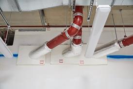
The same attention to detail has gone into the exposed metal ducting and trunking. All too often this can be the undoing of minimalist, ultra-functionalist architects, as M&E subcontractors allow pipes and cabling to take on a life of their own by snaking around chaotically and sprouting undreamed-of layers of access panels, crudely brazed joints, clamps, bolt-heads and switches.
At Thames & Hudson, in contrast, the steel air-supply ducts, hangers and trunking to light switches are neatly assembled and regularly spaced. The overhead ducting is arranged in pairs of cylindrical ducts divided by a narrower cold beam. This triple assembly runs at constant height and girth along the length of the building, raising these lowly industrial products into an art form.
As well as contributing to the aesthetics, the new internal staircase and ubiquitous clear glass and white paint serve more practical purposes. "We wanted all our 120 staff in one building, with very good intercommunications between departments," says Chris Ferguson, Thames & Hudson's client representative. "And we wanted good, natural light for everyone." The £1.6m project provides 2000 m2 of floor space and included the installation of top-grade, category 5 IT cabling below a new raised floor, the refurbishment of the ground-floor entrance foyer and the construction of a small single-storey extension to house a postroom.
While admitting that the cost "is quite a bit in excess of the original budget", Ferguson says, "but at the end of the day, it's a tremendous building that has fulfilled all our requirements." One peculiar client stipulation was that Thames & Hudson's 20 000-volume back catalogue should be prominently displayed in the building. Accordingly, bookstacks have been placed at the centre of each floor. As well as showing off the company product, these give the smart new interiors an attractive lived-in atmosphere. They also give ample scope for philosophical investigation, although most likely not including Bo Diddley lyrics.
Credits
Client Thames & Hudson Architect John McAslan & Partners Structural Engineer FJ Samuely & Partners Services Engineer Rybka Battle Quantity Surveyor Boyden & Company Main Contractor Overbury
Interiors
- 1
- Currently reading
Art for art's sake
- 3
- 4


