


Goulston Street, which lies just off the traffic maelstrom of Whitechapel High Street, fits this less-than-charming East End pattern, even though it serves as a street market on Sundays.
It housed that most archetypal of East End buildings, a public bath and wash-house, until the site was acquired by London Metropolitan University for a library, and then, when the brief was switched, for its law department. The site looks across the street at a five-storey 1930s former warehouse and is overlooked from behind by a 1960s council housing tower.
The architectural commission was won by Wright & Wright, creator of the award-winning hidden wonder that is the Women's Library, also part of the university, which backs on to the site.
The architectural challenge was a similar one: how to create a building with a heart in this alienating urban jungle. For the law department, however, the challenge was intensified by a low higher-education budget of £7m, or £1350/m2, and by a narrow strip of a site at only 15 m wide and 80 m long.
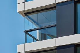
With no room for a courtyard garden like the one that gives open-air relief to the Women's Library, Wright & Wright has created the nearest enclosed equivalent – an internal concourse. This is a spacious, airy "common hall" that stretches about 40 m along the narrow site and rises to double-storey height. Without a garden or courtyard to flow into, the windowless internal space runs the risk of being claustrophobic. But this has been successfully counteracted by putting a glazed roof overhead that floods it with daylight, and by setting up the sturdy yet elegant rhythms of an exposed-concrete structural frame along one side and projecting balconies to an upstairs gallery on the other.
Most significantly, the concourse has been lined on either side with hefty oak benches, along with matching coffee tables and stools, inviting staff and students to linger, sup coffee and intermingle, before they scurry off to the further reaches of the metropolis. As in many contemporary business schools, a vital part of the department's vision for the building was to foster interaction between staff and students – not just to promote a sense of wellbeing and camaraderie but also to provide an informal forum for academic debate. In purely functional terms, the concourse and its upper gallery may act simply as a passageway between teaching spaces, but its generous form, dimensions, furnishings and ambience all combine to transform it into the living, social heart of the department.
With the limited architectural potential of this hemmed-in site concentrated on the central concourse, the teaching spaces have been less successful at holding claustrophobia at bay. The 16 seminar rooms that open off the concourse and its upper gallery have only narrow strip windows, as residents in the houses across the road were concerned about being overlooked. The only window in the staff office looks inwards, onto the concourse. The finest teaching space is a tiered 180-seat lecture theatre in the lower-ground floor, into which daylight is funnelled through strips of skylights along either end.
In functional terms, seminar rooms can be easily subdivided, as concrete ceiling troughs have been cast with a central groove into which soundproof stud partitions can be fitted. With the exception of the lecture theatre, the building relies on low-energy natural ventilation.
In architectural style, the building has a rugged, modern, quasi-industrial character expressed through the exposed structural frame of simple beams and columns in fairfaced, insitu concrete – although the quality of finish in places is less than elegant.
Its functional style continues on the outside, where the flat, unmodulated walls of red brick and central filling of curtain walling have a 1960s feel about them, suggestive of James Stirling's history faculty library in Cambridge. The building abuts the pavement, and on the ground floor it is blind to the street. Coupled with the industrial exterior, this maintains the East End's distinctively hard-edged cityscape – though it does so at the expense of enlivening the depressing surroundings with a touch of academic vitality. The building's real prize can only be appreciated by those who venture off the street and into the inner concourse.
Downloads
The spatial relationship
Other, Size 0 kb
Credits
Client London Metropolitan University Architect Wright & Wright Structural and services engineer Arup Quantity surveyor Davis Langdon & Everest Main contractor Willmott Dixon


No comments yet