- Home
- News

All the latest updates on building safety reformRegulations latest
- Focus
Close menu
- Home
- News
- Focus
- Comment
- Events
- CPD
- Building the Future
- Jobs
- Data
- Subscribe
- Building Boardroom


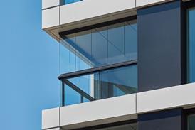


Soho fabulous
By Martin Spring and Martin Spring 2002-11-15T00:00:00
Source: Ian Lambot
Lifschutz Davidson's swanky revamp of 20 Soho Square should appeal to the area's media types – and, like the Ab Fab girls, it has squeezed a lot into a small space …
Already registered? Login here
To continue enjoying Building.co.uk, sign up for free guest access
Existing subscriber? LOGIN
Stay at the forefront of thought leadership with news and analysis from award-winning journalists. Enjoy company features, CEO interviews, architectural reviews, technical project know-how and the latest innovations.
- Limited access to building.co.uk
- Breaking industry news as it happens
- Breaking, daily and weekly e-newsletters
Get your free guest access SIGN UP TODAY

Subscribe now for unlimited access
Subscribe to Building today and you will benefit from:
- Unlimited access to all stories including expert analysis and comment from industry leaders
- Our league tables, cost models and economics data
- Our online archive of over 10,000 articles
- Building magazine digital editions
- Building magazine print editions
- Printed/digital supplements
Subscribe now for unlimited access.
View our subscription options and join our community