


The Second City’s Jewellery Quarter inspired the facade of Make’s astonishing Cube development. But as with any box of jewels, its real treasures are inside
Every decade, Birmingham seems to produce a piece of architecture that tries to redefine the city as a paradigm of urban renewal and cutting-edge design. Each attempt is more audacious than the last, reflecting a city keen to erase the stigma of industrial decline and sixties town planning that left it better known for its motorway junctions than its architecture.
In the nineties, Sir Terry Farrell’s Brindleyplace development became an urban regeneration showpiece. In the noughties, Future Systems’ Selfridges department store gave Birmingham iconic brand status and became one of its few instantly recognisable buildings. Now Make’s £100m Cube is taking centre stage.
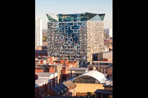
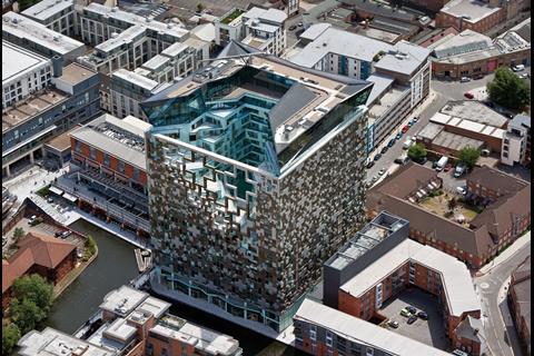
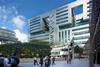
At 23 storeys the Cube has a clear advantage over its predecessors: height. It towers over the city and makes sudden appearances over warehouse roofs and at the end of cobbled streets. And once seen, it’s hard to ignore: the metallic cladding and striking facade have made it one of the most eye-snagging designs in recent history.
Make says the Cube’s looks are a response to its urban context and industrial heritage. The firm is proud of having created a truly mixed-use building, containing residential, commercial, retail and leisure facilities. It is also a scheme with a clear regeneration agenda and one that seeks to engage in and enhance its public realm. However, such is the impact of its architectural language that for many, the extent to which any of these aspects will be appreciated will depend on one’s personal response to its striking metallic skin.
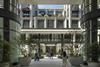
The Cube is situated in the heart of Birmingham, next to the Mailbox development, the converted Royal Mail sorting office that is now home to bars, restaurants, flats, hotels and the BBC’s Birmingham studios. The Mailbox was developed in the late nineties by the Birmingham Development Company, that, as the developer behind the Cube, is keen to replicate the success of its earlier venture.
The two developments are located beside a prominent turn in the Birmingham to Worcester canal, in a district that once teemed with industrial activity. This strong heritage formed a key component of the design concept of the Cube. It is close to Birmingham’s Jewellery Quarter and, as Make founder Ken Shuttleworth explains, it was the jewel concept that inspired the building’s architectural language.
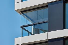
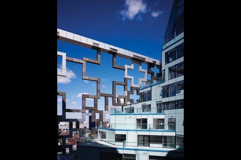
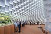
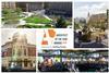
On one of the sides about 40% of the surface dissolves into an open, triangular tracery through which the courtyard can be seen
“We wanted a hard, metallic texture to the surface, a protective box that glistened like a jewel but also referenced the hard industrial heritage of the local area. But inside, we wanted something more crystalline, translucent and precious.”
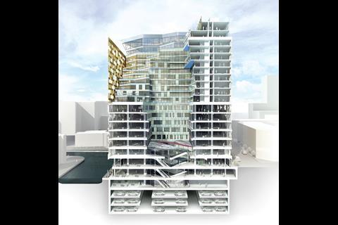
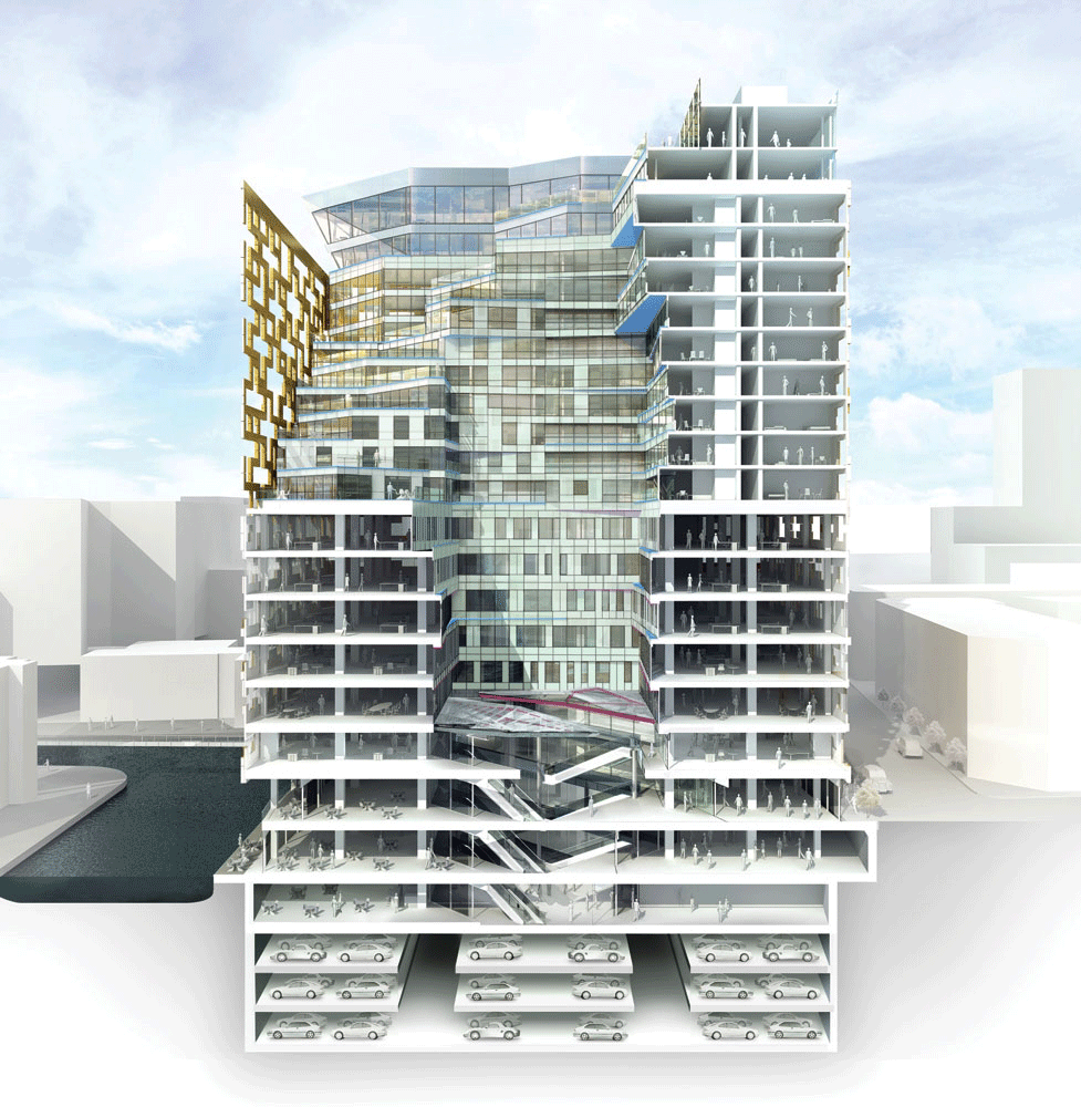
Accordingly, all but the two storeys at the top and bottom are clad in a matrix of anodised aluminium panels. Three variants are used: natural anodised metal, light gold and deep bronze. The colour of each panel also indicates the depth of its protrusion from the glazing line, with the darkest elements projecting least and the lightest most.
The architect sought a treatment that would break down the scale and mass of the building’s surface into smaller textured layers. This was also the intention behind arranging many of the panels in a cross shape. Finally, there was a desire to create an external skin that could conceal all manner of structural variations imposed by the mix of uses in the building.
Although the visual effect is abstract, it is also highly discordant, particularly when viewed from a distance. The cross motif, or any other surface element that might give form or definition to the elevations, is lost in an optical whirlpool that emphasises the bulky mass of the building rather than the articulation of its surfaces.
You might have expected the jewel concept to have encouraged subtle variations in texture and opacity. But the chaotic configuration of the surfaces is more evocative of a stack of disintegrating metallic modules. And with little to relieve what are essentially 18-storey sheer walls (significant portions of which are windowless), the Cube is largely a rigid geometric barrier seeking to impose itself on the urban landscape, rather than to integrate into it.
One exception is the fretwork opening that occupies much of one of the Cube’s sides. On this facade alone, about 40% of the surface dissolves into an open, triangular tracery through which the courtyard in the centre of the building can be seen. The grid pattern is maintained here, but rather than forming a solid, undulating surface, it becomes a self-supporting structural cage that reveals the residential terraces, glazed walls and splayed angles of the inner cube.
Unsurprisingly, project architect Frances Gannon describes the fretwork (which extends over 10 floors) as structurally challenging. Clearly, the complexity was amplified by the structural requirements the fretwork system imposed. However, the fretwork is a dramatic device that provides welcome relief from the ponderous articulation of the other facades. Also, on a building with such a prescriptive elevational treatment, the gesture appears surprising and spontaneous - exactly the kind of theatrical device one might expect from a building conceived as a jewellery box.
By allowing outside views of the building to plunge deep into its core, the fretwork not only breaks down the mass of the Cube but helps embed it into its surrounding urban fabric. It also reveals that there are in fact two Cubes, not one. In line with the original concept outlined by Shuttleworth, the outer metallic cube protects its inner crystalline counterpart. The main external clue to this second cube is the double-height glazed crown that surmounts the aluminium box.
As well as the glazing, the asymmetrical angles of the crown contrast with the orthogonal geometry below and seem to suggest that the inner cube is poised to break free from its angular straitjacket. Once again the effect provides a welcome piece of drama.
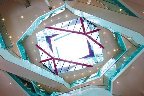
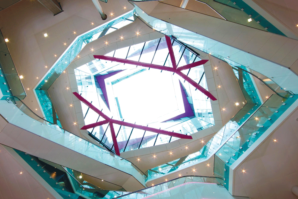
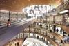
But it is inside the building where the unique character of the inner cube is revealed. The middle of the Cube is occupied by a courtyard that extends to its full height. The lower half is enclosed on all sides, but the upper half is open on the same aspect as the external fretwork facade, letting natural daylight permeate the lower storeys.
The inner courtyard is clad almost entirely in glass and is formed by the same splayed geometries and diagonal lines visible on the external crown. In fact, on the four lower retail levels at least, all reference to the cubic shape is banished and the courtyard’s footprint is a skewed polygon aligned to a diagonal axis that cuts the building in two.
This courtyard is far more successful than the exterior. Architecturally, its glassy, translucent skin evokes a sense of precious jewellery far more effectively than the mechanically laboured cladding of the facades. When looking up, the complexity of the shifting angles and layered, offset planes that constitute each floor create a dramatic vortex that appears to burst through the upper fretwork like lava through a volcano.
With the staggered, stacked terraces that recede back from the courtyard edge on the upper residential floors, the courtyard resembles a dynamic mini-city in itself. Shuttleworth refers to the Cube as a “vertical city”. It is only internally where this intense sense of urban density and concentration is realised.
The city metaphor is further emphasised by the courtyard’s treatment of public realm. The diagonal orientation of the courtyard has been generated by pedestrian desire lines linking the Cube to the Mailbox and other public spaces. Vertically, the four retail storeys knit together the multiple changes in level around the site. With the courtyard publicly accessible 24 hours a day, it has the potential to become an independent pedestrian route and destination in its own right.
Finally, the courtyard exposes the vertical order into which the building’s mix of uses are arranged. A glass panel inserted into the floor of its lowest level allows a tantalising glimpse into the triple-storey, 399-space car park below. This is the UK’s largest fully-automated car park. A computerised, swipe-card system by German manufacturer Wohr stacks cars robotically and accommodates three times as many vehicles as a ramped design would have permitted.
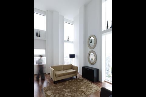
Above the four retail levels, there are five storeys of commercial office space, half of which have already been leased by the Highways Agency. The Cube’s 244 private-sale residential units are stacked on the nine floors above the offices, many of which are duplex apartments offering double-height spaces and generous outside terraces. A boutique hotel is located on the floor above these while the uppermost crown level will contain a public, panoramic sky-level bar and restaurant. Although a tenant is still being sought, this spacious amenity will be a first for Birmingham and offer views across the city. Unlike many of the commercial schemes that make the claim, the Cube is a truly mixed-use development.
It will not be the only building in Birmingham’s latest urban renaissance. The twin concrete cores of Dutch practice Mecanoo’s Library of Birmingham are already visible from the Cube’s sky lobby and Foreign Office’s much delayed redevelopment of New Street station is set to get under way shortly. The Cube itself was subject to few of the onerous planning townscape impact assessments that would be demanded for a building of its height in central London. Birmingham is clearly a city happy to embrace “starchitecture” in order to gain civic kudos and raise its cultural profile.
There are obvious benefits to such a strategy. But as London will discover when its conveyor belt of skyscrapers gets moving again, this vision ignores the fact that it is not individual buildings or catchy nicknames that create successful cities, but thriving public spaces and strong urban character. The Cube’s generous integration with the public realm ensures that it satisfies the first category. The quality of its contribution to the second remains far from assured.
In its methodical referencing of local industrial heritage, Shuttleworth, who grew up in Birmingham, argues the Cube is a “contextual” building. But one is forced to wonder if the Cube says more about Make than it does about Birmingham. Make’s predilection for ostentatious cladding is well known. It is also natural for any firm to infuse any dialogue with the building’s context with its own aesthetic ideology.
But if a core aim of urban regeneration is to enhance local character and landscape, the Cube’s priorities presumably lie elsewhere. It was never a building designed to blend effortlessly in with its surroundings, nor should there be any compulsion for any new architecture to do so. This is even more the case when so much of Birmingham’s urban fabric still retains the damage wrought by sixties’ redevelopment. But in its uncompromising treatment of scale, surface and form, the Cube reveals an insensitivity that betrays the purity of intent so evident in its courtyard and its core concept. Buildings, like books, are never best judged by their covers. Hopefully time will engender the empathy required not to judge the Cube solely on the basis of its skin.
Project team
Client Birmingham Development Company
Architect Make
Structural engineer Buro Happold
Services engineer Hoare Lea
Cladding specialist Haga
Project manager Faithful + Gould
Contractor BuildAbility


No comments yet