


Nottingham Trent architecture students on the controversial and colourful scheme in central London
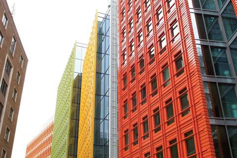
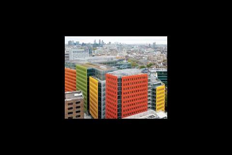
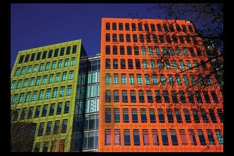
Renzo Piano’s colourful Central St Giles mixed-use development in London replaces a grim fifties Ministry of Defence building. Comprising 405,000ft2 of office space in an 11-storey building with 190 flats in a separate 15-storey block, it is visually lively exposing a riot if reds, yellows, oranges and greens. There is a public piazza between the two buildings and right at the centre of the site, surrounded by 24,500ft2 of ground floor retail and restaurant space.
Hannah Thomas’ verdict
Obviously and unavoidably the first thing one notices about Renzo Piano’s regeneration project of Central St. Giles is his ample and daring use of colour. At first, to me, his use of the primary red and yellow interspersed with a lime green seemed like a shameless gimmick to draw curiosity and attention the a little used area of London.
It was only on further consideration that the colours began to grow on me, rather than seeming garish they add a freshness and playful air to an area of uninterrupted grey, and surprisingly instead of highlighting the surrounding buildings’ inadequacy they allow the historic context to become a canvas for this riot of colour. The structure and form of the buildings are another device Piano uses to seamlessly integrate his project, the lines and windows of the buildings mirror those that surround them and its orientation, takes advantage of existing pathways and creates more.
The continuation of the colour palette to the detailing inside allows the considered and thoughtful approach of the architect to manifest itself, the building has a clear identity but does not deter prospective users by being cartoonish and childlike.
Here through use of colour and form I believe Piano has created a multifunctional space that cleverly balances playful aesthetics with solid function and design.
Amie Taylor’s verdict
Nowadays, architecture is often muted to neutral and boring tones that lack expression and emotion.
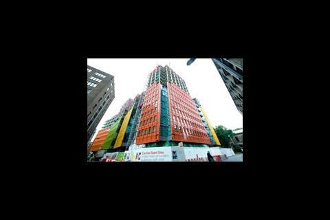
It is a shame, however, that the colourful elevations that face onto the street do not continue onto the façades that overlook the square - Taylor
However, the splash of colour in Renzo Piano’s Central St Giles project brings this dull and neglected area of London to life and with it new retail, office and residential opportunities. Not only do the playful use of colours encourage a sense of enjoyment and fun for the working environment, but it has also been successful through the strategic application of the palette which achieves a fragmentation of the mass; thus reducing the harsh visual impact large office blocks commonly bestow upon the public realm.
It is a shame, however, that the colourful elevations that face onto the street do not continue onto the façades that overlook the square, as a more reserved use of colour could have still been effective yet fitting for the more subtle design approach intended for the piazza.
Despite this, the public space that is contained within the ‘horseshoe’ of buildings does have a graceful transition through to the street - this has been created through well-positioned entry points and the use of a glass ground floor retail units. Whilst some might consider this development as nothing more than pure novelty, for me the injection of vivid colours is a breath of fresh air for architecture of the current age.
Hannah Thomas and Amie Taylor are studying architecture at Nottingham Trent University
Source
To join the First Impressions panel email nargess@me.com


No comments yet