


This year the award no one wants to win goes to an office development in London’s Victoria
An office and residential building in London’s Victoria has been haned this year’s Carbuncle Cup.
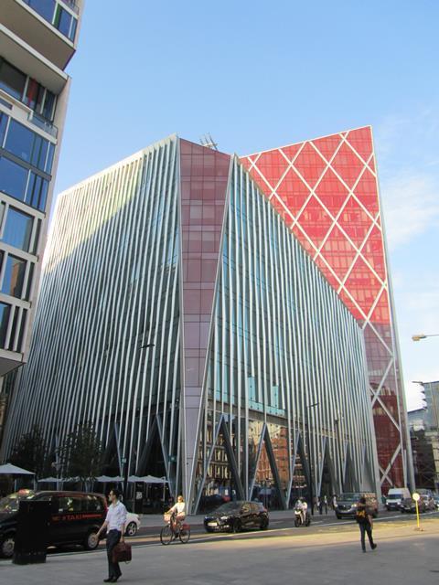
Nova Victoria, which occupies a whole city block in the area, consists of two office buildings designed by PLP Architecture and a residential building designed by Benson & Forsyth. The award goes to PLP Architecture for the office buildings.
The competition, run by Building’s sister title BD, was launched in 2006 and is awarded to the “ugliest building in the UK completed in the last 12 months”.
The winner was selected by a panel of judges including BD editor Thomas Lane, Twentieth Century Society director Catherine Croft, Urbed director and chair of the Academy of Urbanism David Rudlin, who won the Wolfson Economics Prize in 2014, and BD assistant editor Elizabeth Hopkirk. Readers’ comments were also considered during the judging process.
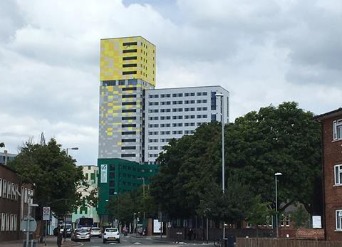
The development is bordered by Victoria Street, Bressenden Place and Buckingham Palace Road and consists of two office blocks running across 480,000sq ft called Nova North, at 12 storeys high, and sister building, the 16-storey Nova South.
The scheme, which was built by Mace, has been developed by Landsec with the firm describing the two blocks as ” two distinct, architecturally daring buildings within the Nova scheme. Together, they create a new landmark business address in London”.
But the judges said the building as ”crass”, ”over-scaled” and ”a hideous mess”.
Croft added: “Nova should have been good, as it’s a prestige site. It makes me want to cringe physically. It’s a crass assault on all your senses from the moment you leave the Tube station.”
And Rudlin said triangular building forms were inefficient and that he was concerned about the zig-zagging fins which are applied across a large amount of the two office buildings. He added: “There’s no variety and you can’t read the floors.”
He said the red cathedral like spire on Nova South was a particular cause for concern, adding: “It’s got the same proportions as Salisbury Cathedral. For me the spire gives it carbuncular status – otherwise it’s just a bad building.”
BD editor Thomas Lane said “The architect appears to have been inspired by the fractured, angular shapes beloved of stararchitects like Frank Gehry and Daniel Libeskind and applied these to a run-of-the-mill spec office development.
”The result is two large blocks sliced and diced to create to create a series of angular volumes drunkenly leaning on each other. These volumes are clad with a medley of oversized vertical fins that zig zag up the façade to give each elevation a headache-inducing moiré pattern when viewed from the side.”
Previous winners of architecture’s wooden spoon have included Media City at Salford by a number of architects including Wilkinson Eyre and Chapman Taylor, Grimshaw’s Cutty Sark renovation and Rafael Vinoly’s Walkie Talkie building.
Carbuncle Cup 2017 shortlist
Nova Victoria by PLP Architecture
Pity poor Victoria. Rebuilt in the 1960’s after WWII bombing, the area is now being extensively redeveloped by Land Securities but sadly not for the better. The latest offering is Nova Victoria, a 897,000ft² mixed-use development occupying a whole city block. The architect, PLP has attempted to break up the monolithic nature of these scheme by expressing it as a pair of sliced and chamfered towers and jazzing it up with several bright red prows presumably to give it that ‘landmark’ quality. Instead several readers questioned how it got planning.
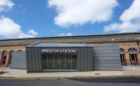
Preston Railway Station Butler Street Entrance by AHR
The residents of Preston took to Twitter in droves to denounce Preston Railway Station’s new entrance which replaced a 1980’s building that mimicked the station’s Victorian style.
Operator Virgin Trains said it was a “contrasting structure to create a more modern and passenger friendly environment”. The residents of Preston clearly preferred the former entrance variously describing the new building as an “eyesore”, “hideous”, “a joke” and “planning gone mad”.
Nominator Steve Webberley described it as a “deadening cake tin slapped on its side”. He said: “This fractured geometric lean-to would seem out of date 10 years ago. It isn’t even that well-planned inside. The relationship with the window line of the brick station is laughable. We’ve come a long way from Brunel. A very long way…”
Greetham Street Student Halls, Portsmouth by Cooley Architects
Greetham Street Student Halls looks like it was inspired by a Carbuncle Cup nominee from 2015, a student hall in Southampton called City Gateway. It was nicknamed the ‘fag butt’ by unimpressed locals for a centrepiece tan and beige coloured circular tower. Like City Gateway Greetham Street Student Halls features a tower with two tone cladding and the same discordant jumble of multi-coloured rectilinear blocks at the base.
The nominator, Kieran Clarke said, ‘It seems that the building’s architects were either colour blind when choosing the external cladding or wanted to blind others with the bright yellow cube at the top of their tower.’
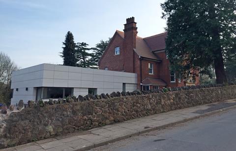
8 Somers Road, Malvern by Vivid Architects
This home has been refurbished and enlarged with a procession of extensions. The design and access statement accompanying the planning application describes these as ‘subservient and understated with a crisp modern aesthetic distinct from the historic house’.
The nominator Robert Smith disagreed, describing the extension as a ‘Lego brick’. He said, ‘I am aware that planning guidelines today are to keep a clear boundary between new and old structures, but the architect has made no attempt to unify the house and now most people assume this family home to be a medical centre.’
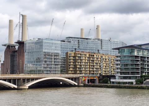
Circus West, Battersea Power Station, London by Simpson Haugh
Circus West pulls off the feat of making Europe’s largest brick building look small and was a very popular nomination with the BD readership. Comments included, ‘A great case of gross over development - it’s disgusting!’, and ‘Now we’re talking…. might as well stop the rest of the nominations being listed. We have a winner right here.’
Many of our readers also pointed out the blame for this building should be shared with Rafael Vinoly who was responsible for the masterplan. Unfortunately this scale of overdevelopment has been forced on the power station because of a series of bad deals made by a series of owners needing to recoup their investments.
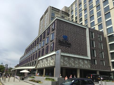
Park Plaza London Waterloo by ESA Architecture
This dowdy beige 1950s government building to hotel conversion has been jazzed up presumably to draw in the punters.
The lower lower storeys are swathed in tiles whose pattern would cause havoc on a TV screen, and whose colours manage to be both gaudy and drab at the same time.
To draw attention to the entrance, the architects lifted the cornice at one corner and wrapped a weird screen around it. It looks like the skin has been peeled from someone’s torso, exposing a spaghetti of blood vessels and veins beneath.


No comments yet