- Home
- News

All the latest updates on building safety reformRegulations latest
- Focus
Close menu
- Home
- News
- Focus
- Comment
- Events
- CPD
- Building the Future
- Jobs
- Data
- Subscribe
- Building Boardroom


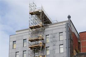


Is the construction industry 13% bigger than we think it is and does it matter?
By Brian Green2013-03-18T11:30:00

If the figures are saying one thing and the real world is behaving in another then the assumptions driving policy will be suspect
Already registered? Login here
To continue enjoying Building.co.uk, sign up for free guest access
Existing subscriber? LOGIN
Stay at the forefront of thought leadership with news and analysis from award-winning journalists. Enjoy company features, CEO interviews, architectural reviews, technical project know-how and the latest innovations.
- Limited access to building.co.uk
- Breaking industry news as it happens
- Breaking, daily and weekly e-newsletters
Get your free guest access SIGN UP TODAY

Subscribe now for unlimited access
Subscribe to Building today and you will benefit from:
- Unlimited access to all stories including expert analysis and comment from industry leaders
- Our league tables, cost models and economics data
- Our online archive of over 10,000 articles
- Building magazine digital editions
- Building magazine print editions
- Printed/digital supplements
Subscribe now for unlimited access.
View our subscription options and join our community