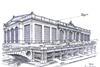
Quinlan Terry’s sketch of Chelsea Barracks proved that even a doodle can make waves. It inspired us to ask four architects to imagine how some traditional London landmarks might look with a twist

From meddlesome, letter-writing royals to irate Belgravia residents, plenty of people were pleased to see Richard Rogers dropped as architect from the Chelsea Barracks scheme last month.

But few could have predicted that a couple of scruffy doodles, never meant for publication or even consideration in their rough state, would have been the driving force behind Rogers’ eventual removal from the £1bn Qatari Diar development.

By now, the background to all of this is well known. In April, the Prince of Wales appealed to the Emir of Qatar, the lead investor, to scrap the modern glass and steel scheme, and consider plans by traditional architect Quinlan Terry. These “plans” were in fact just a series of rough sketches in response to a desperate plea for help from a local resident.

The power of these drawings proved that, back-of-a-fag-packet or not, the roughest of sketches can be enough to provoke controversy and so Building thought it only fair to give the modernists a chance to show how much of an impact they could make with their own alternative sketches, this time of some of London’s most famous historical landmarks.

With an informal, five-line brief each, architectural practices Make, Flacq and Alsop were let loose on St Paul’s cathedral, Buckingham Palace and the Tower of London.

We catch a glimpse of just how different London might look if turned over to the modernists … but first, another example of the traditional-style redesign that sparked so much debate, this time a Robert Adam Associates version of Rogers’ Heathrow Terminal 5 building.

George Saumarez Smith of Robert Adam architects on his traditional version of T5

(Pictured above) The design is intended to be pretty close to the Richard Rogers scheme, except in style. I am not an expert in how airports work so I have assumed that the general layout is non-negotiable. Buses, cars and trains arrive on one side, and the planes are all on the other.

The big difference is that the airport terminal itself is designed as a classical building in the tradition of great glazed halls, markets and train stations. I definitely think that the building should celebrate air and flight, but in order to do this it doesn’t need to be made entirely of glass or look like a bird. There obviously needs to be plenty of natural light, so there are very large openings framed by giant piers.

The closest comparison in terms of classical architecture is a giant basilica, so you might call this a “basilica aeronautica”. The design allows for decoration and sculpture where appropriate, particularly around the main entrance and in the middle of the side facades. The huge figure over the main entrance is Hermes, the god of flight.

Of course, flying is not the most environment-friendly means of travel, but all the more reason why this building should be built sustainably. The intention is that the non-glazed parts of the building would all be in natural stone. While this would be expensive, I doubt that it would cost more than a fully glazed building and it would certainly last longer and would require less maintenance. Much of the work would be done by hand which would provide a huge boost to the stonemasonry industry and to craft apprenticeships. And if the airport terminal is no longer needed one day, it could become an exhibition hall, a factory, or a museum.

Ken Shuttleworth of make on his redesign of St Paul’s Cathedral

This proposal is one vast awe-inspiring space that lifts the spirits and heightens the sense of a special religious experience. It echoes the old space created by Wren but is also reminiscent of those other great religious experiences of the Taj Mahal, Hagia Sophia and Notre Dame.

The structure is a three-pinned arch with triadectic trusses spanning the full height. The dimensions are 60 x 180m, rising up to the sky, and at its highest point, 120m. The building is effectively one continuous roof, more than discernible walls, providing a distinct shape on the skyline.

The giant west glazed wall is raised to reveal the main entrance, providing an awe-inspiring arrival at St Paul’s. The entire west wall itself is a permanent translucent black and white masterpiece by the artist Brian Clarke. The east wall is of equal size and internally features another work of art by Clarke, this time in brightly coloured glass. The north and south walls rise up unsupported and are solid, with slots of light creating shadows on the floor.

For sustainability, the south side has photovoltaic panels and wind turbines at roof level at the apex, alongside the bells, while the crypt incorporates water storage boreholes.

To provide flexibility the altar is moveable and can be reconfigured to allow for other arrangements.

Ken Shuttleworth of make on his redesign of St Paul’s Cathedral

Feix & Merlin on its redesign of the Tower of London

The brief primarily called for a new, iconic tourist attraction but at its heart would be the royal residence, an armoury, a menagerie (or zoo), and of course somewhere to house the precious family jewels. A special red velvet-lined moat at the base of the inner crown will keep the unwanted riff-raff at bay.

The new Tower of London is made up of inner and outer layers, ever-decreasing circles of accommodation that become more private as you get further and further into the middle, and nestled at its core the inner sanctum – the private royal residence and a chance to take a peek at the jewels.

The outer circle, the most public, is a new tourist attraction of a scale that would rival the London Eye. A giant rotating Crown Carousel incorporates viewing pods, The London Eye-Balls, that sit at the top of

each prong. The whole thing rotates 360 degrees every half hour, offering changing views of the protected-view corridors that are so loved and cherished.

Additional spaces, such as the armoury, exhibition spaces and of course an aviary for the royal ravens are located around the outer layer, as the gems on the crown. Other royal animals are allowed to roam freely in the new public garden below.

Tarek Merlin would like to replace the Tower of London with a giant crown, where ostriches can roam free

Tarek Merlin of Alsop and Feix and Merlin on his redesign of the Tower of London


Hal Currey and Marcus Lee of flacq on their redesign of Buckingham Palace

The space has been designed to embrace the public by creating a piazza focused on the Mall, replacing railings with moats and ha-has and tarmac with stone.

It also addresses an issue of controlled transparency, symbolic of a more accessible monarchy. Views are permitted into their inner world through visitor centres and information areas, but these are balanced with the need for heightened security.

There is a big focus on green at the palace: a combination of arboretum, winter gardens and allotments plus an environmentally responsive built fabric pushes it into the 21st century, as well as giving Prince Charles somewhere to talk plants rather than planning.

And finally we wanted to design for change by making sure there was an efficient structural solution here to create a flexible framework, allowing for internal alterations while maintaining an unaltered public face.


Hal Currey and Marcus Lee of Flacq on their redesign of Buckingham Palace