


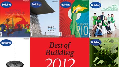
Building’s group art editor explains the story behind some of Building’s covers over the past 12 months
6 January 2012 - Issue 01
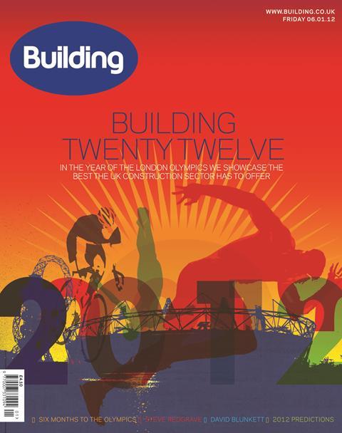
We wanted to start the year with a positive, energetic and vibrant cover focusing on the eagerly anticipated London 2012 Olympics.
13 January 2012 - Issue 02
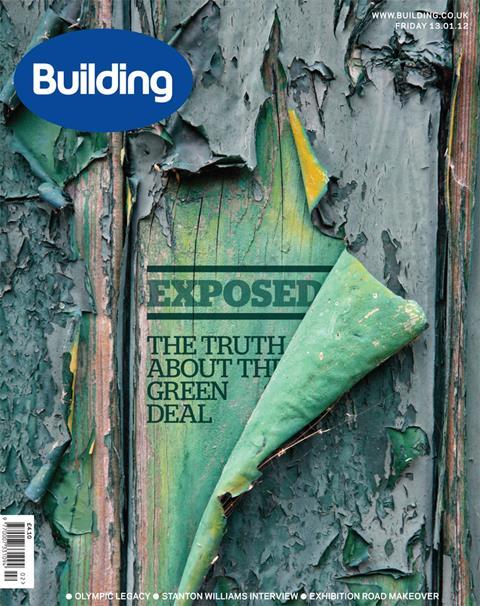
We had originally commissioned an illustration for the Green Deal cover with a brief to convey the ideas of revelation and uncovering. What we received we felt did not quite work in terms of story and concept - so the we had to pull something together at short notice to make the press deadline. This image is actually a modified stock-shot from getty, with type superimposed. Simple and effective.
16 March - Issue 11
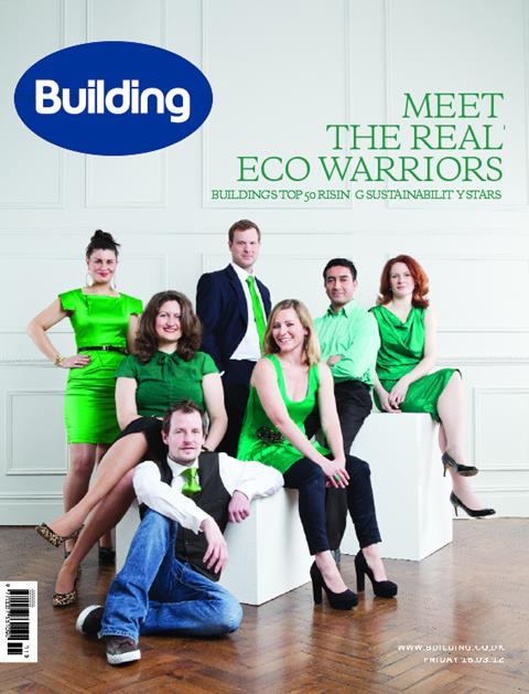
For our eco-warrior cover we commissioned and art directed Michael Clement, a leading celebrity photographer, to shoot our subjects - all of whom are young professionals from a sustainable design and engineering background - all wearing an item of green clothing. This was a fun piece to art direct and stage for all involved - and resulted in an unusual and engaging front cover.
20 April - Issue 16
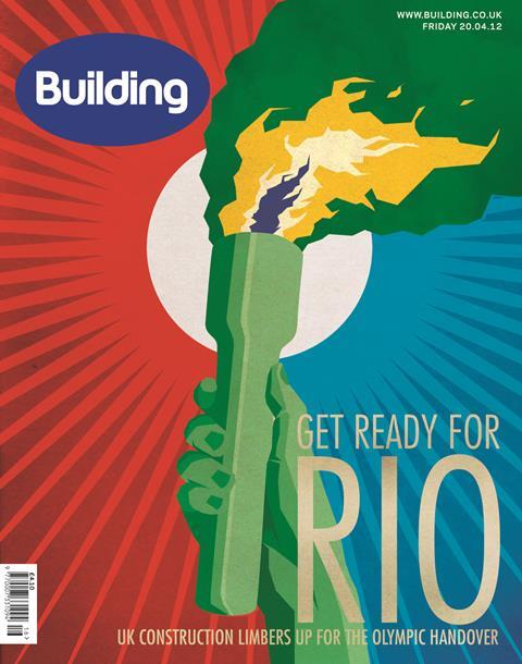
Another Olympics-related illustration cover this time celebrating the recently announced 2016 Olympic venue, Rio. Inspired by retro posters we wanted a vintage look that captured the colourful, celebratory nature of both the host nation and event.
27 April - Issue 17
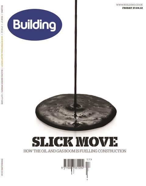
The interplay with the headline and the image worked well here - a very simple stock shot effectively illustrates the message. Our attempts to be clever with the barcode underneath did not go down well with the magazine stockists apparently.
13 September - Issue 28
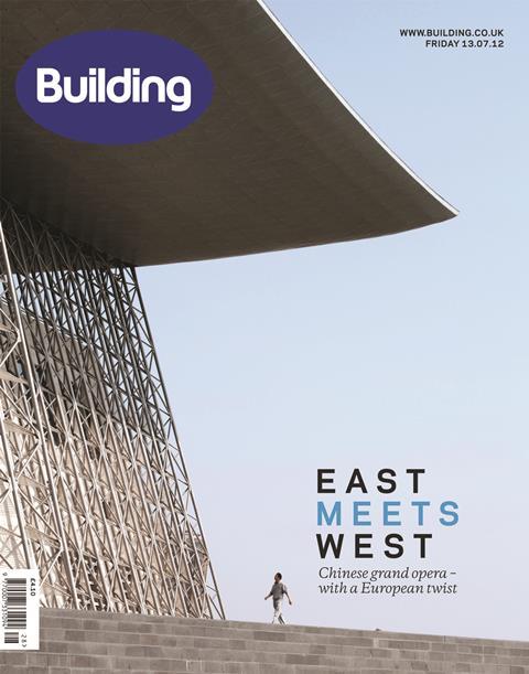
This is a beautifully composed photo of the Wuxi Grand Theatre in China designed by Finnish practice PES-Architects. The slightly asymmetry of the image is nicely counterbalanced by the small figure in the foreground, dwarfed by the structure beyond. The photographer was Jussi Tiainen.
31 August - Issue 35
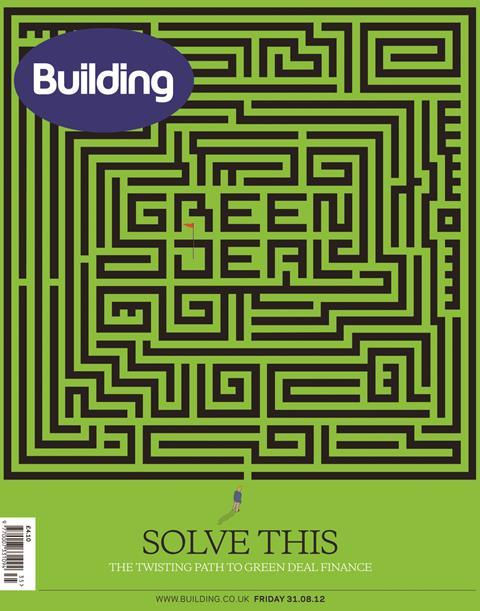
A very graphic treatment for this cover about the Green Deal: hidden type worked into the graphics and a catching headline complete the composition.
26 October - Issue 43

David Levene, well known for his great portrait and news photography for the Guardian, took this shot of Mike Peasland at Balfour Beatty’s offices for this cover. David is one of those rare photographers who without fail manages to successfully capture personality and character in a single shot.
Rarely working from a studio, and more often simply meeting subjects at their place of work in limited timeslots in their busy diaries, he quickly manages to transform everyday backgrounds into points of interest, and using ‘found’ objects on site as interesting props. In this instance David made effective use of directional spot lighting to transform what in reality was a drab office wall into an atmospheric studio backdrop.
9 November - Issue 45
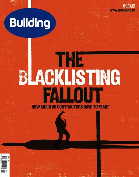
Our blacklisting cover conjures up imagery of the poster designs of Saul Bass - one of America’s leading mid-century graphic designers. A style that has more recently been adopted for the well-known opening sequence of Mad Men, we wanted to draw on the recognisable silhouetted figure whilst also working the headline into the graphics.
30 November - Issue 48

A fun typographical collage was our response to the Top Specialists cover this year - the colours and composition of letters and numbers work to suggest a variety of skills and activities undertaken by the specialist contractors that the magazine seeks to focus on.


No comments yet