


Our latest student is not too impressed with the 10th Serpentine pavilion in Hyde Park
Pete Collard’s verdict:
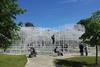
“This year marks the 10th anniversary of the Serpentine pavilion scheme, a concept that has developed into a key event in London’s architectural calendar. The idea of only using architects who are previously ’unbuilt’ in the UK has allowed a glimpse of what has potentially been missing from the nation’s skyline. However, given the imminent completion of Nouvel’s One New Change retail and office complex next to St Paul’s Cathedral it would appear that this concept is being stretched somewhat.
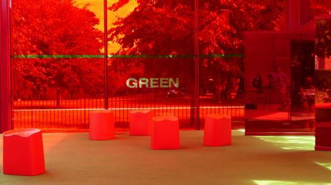
Approaching across the scorched grass of Hyde Park, it is clear from a distance that the main focus of the pavilion is its colour. It’s red. Really red. And not just the steel pavilion, the bar, the furniture, the carpets, even the fridges are red.
Compared to the beautifully understated pavilion by SANAA last year, Nouvel’s design brings to mind the Ferrari hospitality area at the Monza Grand Prix
Nouvel has offered the symbolism of the colour to the London psyche (telephone boxes, double-decker buses etc) as one reason for his choice, alongside a link to the emotions inspired by the sun. A further motive given is that red is a complimentary colour to the green of the park. It is somewhat ironic then that Nouvel should build his pavilion during one of the rare London summers that the grass turns dusty brown.
From within the pavilion, Nouvel’s preoccupation with red becomes overpowering and at times headache inducing. Yet from behind the relative safety of a pair of sunglasses it appears that little thought was devoted to the actual design of the building. The retractable canvas awnings, pivoting mirrored glass panels and hangings fabrics (all red obviously) feel cheap and lack any sense of obvious cohesion, aside from their colour.
Compared to the beautifully understated pavilion by SANAA last year, Nouvel’s design brings to mind the Ferrari hospitality area at the Monza Grand Prix or a beach bar in Rimini. The use of such a dominant primary colour is a bold decision, and perhaps an appropriate one for an ephemeral summer structure, it is a shame however that the structure itself fails to stimulate in equal measures.”
Pete Collard is currently completing a masters in curating contemporary design at Kingston University/Design Museum.
Source
If you would like to take part in our First Impressions email nargess@me.com.


No comments yet