


Bathonians were up in arms when Eric Parry Architects sought to add a modern extension to an 18th century, grade I-listed building. But the architect won out and the Holburne Museum shouldn’t have anyone reaching for the smelling salts
Battles between contemporary architecture and conservationists are hardly new and have helped forge Britain’s urban landscape for decades. But even by the normally combative standards of heritage conservation, the extension to Bath’s Holburne Museum ignited a formidable punch-up. When visitors arrive at the newly refurbished building when it re-opens tomorrow, what strikes them most may well not be what it looks like but that it was ever built at all.
Since Eric Parry Architects won the competition to remodel the graceful 18th century villa in 2002, the scheme has been forced to endure a level of orchestrated opposition that would probably have sunk many other projects. A highly organised militia of traditionalists, heritage campaigners and locals assembled to denounce the scheme and a “Halt the Holburne” campaign was established, summarising its intent with the proclamation: “This is no place to make modern architectural statements.”
Incredibly, an alternative, classical, scheme even gained planning permission and waited menacingly in the wings “should anything go wrong with the [approved] plans”.
Several redesigns and a number of planning applications were all executed under the ever-watchful eye of statutory authorities and historical societies, such as the Georgian Group. In addition, Holburne’s status as a grade I-listed building within a listed landscape and Unesco World Heritage Site, merely intensified the scrutiny. And to cap it all, this was all being conducted in the city of Bath, a conservation tinderbox whose deep preservationist instincts make the City of London look like the Wild West.
Is the finished building worth all the trouble that preceded it? For many, the answer will inevitably depend on which side of the style fence they sit on in the endless classicism vs modernity debate. But for those willing to take a less partisan view, Holburne presents a fascinating insight into the trials of conservation design, both political and aesthetic. It also sets a significant precedent in the long-standing conundrum of how to adapt historic buildings with a contemporary architecture that preserves and celebrates the integrity of both.
A ’Halt the Holburne’ campaign was established, with the proclamation: ’This is no place to make modern architectural statements’
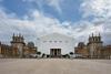
The Holburne Museum is housed in the decadent 18th century leisure resort, the Sydney Hotel, completed in 1796. Designed by local architect, Charles Harcourt Masters, in an elegant, neo-classical manner, it performed a unique dual role. Its principal facade still terminates a magnificent 600m-long urban vista up one of Bath’s grandest streets. Yet it also acted as a gateway to lavish pleasure gardens at its rear; a landscaped oasis with minstrels and supper boxes (dining huts) among trees and lawns.
From 1913-16, Sir Reginald Blomfield, rebuilder of John Nash’s iconic Regent Street Quadrant and facades at Piccadilly Circus, completed extensive renovations which essentially gutted the building and transformed it into a museum. Blomfield reinterpreted the building’s “gateway” role by blocking the internal route to the garden with a new central staircase and relocating garden access externally. This was achieved via new twin loggias either side of the building. As was his trademark, he also added Francophile decorative flourishes to the facades such as shallow oval bas reliefs and elongated windows.
Parry’s recent intervention is two-fold and involves the refurbishment of internal spaces within the existing building and the addition of a new extension at the rear. Both elements had a construction budget of about £3.5m. Blomfield’s principal rooms - a grand, lofty ballroom on the first floor and a gallery above it on the second, both occupying the full width of the block behind its principal frontage - have been extensively refurbished. This involved cosmetic enhancements as well as improvements to lighting and ventilation.
The most crucial interior alteration was the relocation of Blomfield’s staircase from the centre of the building to the side. Critically, this re-opens the building’s central axis and re-establishes the direct connection from the front of the museum to the garden.
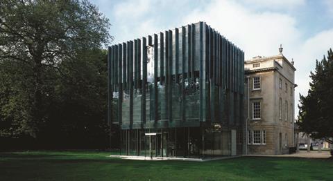
But by far the most controversial component of the project is the extension. Here Parry has created a three-storey glass cube partially clad in glazed green ceramic and whose stacked, tripartite arrangement directly informs the elevational treatment applied to its facade.
It was key that the new gallery space be located on the same level as Blomfield’s second floor gallery. This meant that the largely windowless new gallery occupies the top of Parry’s extension. As such, this level is treated as a solid with the glazed ceramic panels extended to the outermost edge of the extension’s footprint and ribbed with vertical, irregularly set-out elliptical profile ceramic fins. The irregularity is a consequence of Parry’s reluctance to impose a grid here and typifies the mannerist mischief found in much of his work.
Clearly the extension looks nothing like the original building. But Parry never intended it to - and he was right
Below this lies the middle floor housing the museum’s permanent collection, split internally by a mezzanine.
And the bottom level houses the new garden room, a fully glazed and transparent space that acts as the mediator between the built fabric and natural landscape. By this point the ceramic fins have disappeared entirely and the room itself is encased behind an 800m glazed void that also extends upwards to wrap around the middle level.
Parry’s new extension therefore is a top-heavy, veiled jewel box whose solidity, indicated by its myopically dripping fins and the recessed inner box on the lower two storeys, appears to be gradually dissolving from top to bottom. This ambiguous vertical diffusion is both an organic and illusionary gesture and provides a subtle metaphor for the museum’s gateway role between the physical and natural worlds; town and garden.
It is also exquisitely detailed, from the joint-less glazed corners to the ceramic capping soffits of the vertical fins. The ceramic itself, speckled with dashes of titanium dioxide to soften its impact, creates a mercurial multiplicity of colour and tone. Its natural reflectivity compliments the glazing and in direct sunlight it erupts into a blazing sheen of molten silver.
Clearly the extension looks nothing like the original building, hence the conservationists’ complaints. But Parry never intended it to - and he was right. Despite the conciliatory inclusion of locally sacred Bath stone on earlier schemes, Parry explains that “he resisted the use of stone to make a clear distinction between the new and the old”. In fact, the stark material contrast between the warm, textured, yellow of the original stonework and the glazed patina of the ceramics heightens the sense of separation between the two wings and emphasises the inherent uniqueness of each.
However, contemporary adaptation should never be used as an excuse for aesthetic autonomy and the new architecture goes to great lengths to be sensitive, if not sympathetic, to the old. The extension is no higher than the existing block. It is symmetrically aligned on its central axis. It occupies a narrower footprint than the existing block and so does not impede on the protected vista that extends from the front facade of the building. The linear fins also recall the columns in the loggia on either side.
The fully glazed ground storey enables the extension to appear to float above the ground, minimising its contact with the older wing. The form and proportions of the extension ape those of the supper boxes that once populated the garden.
Inside, the link between town and garden is also celebrated by the internal layout being generated by the newly restored central axis. On the first floor, the magnificent vista from Great Pulteney Street plunges into the centre of Blomfield’s ballroom before piercing right into the heart of the extension’s gallery space and out into the garden.
Parry’s new first floor gallery space is a warren of angular crevices and corners and maintains just the right level of intimacy and enclosure for the treasures contained within. The upper gallery is less successful, with a thick centrally suspended bulkhead ceiling creating a set of awkward and unresolved details, most noticeably in the incongruous appearance of a solitary inclined beam at each corner.
The Holburne sits in the alternative camp of conservation - seeking harmony through contrast and attempting to reinterpret, not copy the old. It is an incredibly difficult balance to achieve. If modernity can be implemented with the same subtle reverence for history and landscape that is dramatised at Holburne, then it need not threaten the integrity of older buildings and holds the promise of creating the treasured heritage of future generations.
PROJECT TEAM
architect Eric Parry Architects
client The Holburne Museum
main contractor Sir Robert McAlpine
project manager Cragg Management Services
structural engineer Momentum Consulting Engineers
services engineer Atelier Ten
conservation architect Richard Griffiths Architects
facade consultant Arup (Facade Engineering)


No comments yet